
Most Popular
Is Auckland over or undervalued?
This graph is often used to get a sense of whether property prices look “cheap” or “expensive” within Auckland.
Read MoreSee which regions in New Zealand are considered overvalued or undervalued based on market data.
Most Popular
This graph is often used to get a sense of whether property prices look “cheap” or “expensive” within Auckland.
Read More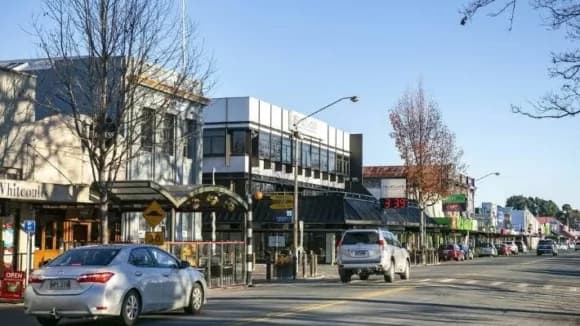
This graph is often used to get a sense of whether property prices look “cheap” or “expensive” within the region.
Learn More

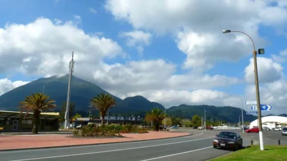
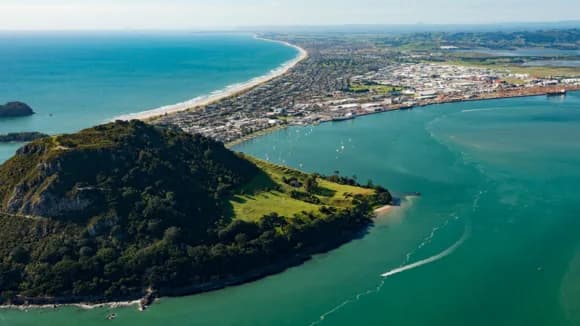
This graph is often used to get a sense of whether property prices look “cheap” or “expensive” within Bay of Plenty.
Learn More
This graph is often used to get a sense of whether property prices look “cheap” or “expensive” within the region.
Learn More

This graph is often used to get a sense of whether property prices look “cheap” or “expensive” within Canterbury.
Learn More
This graph is often used to get a sense of whether property prices look “cheap” or “expensive” within the region.
Learn More

This graph is often used to get a sense of whether property prices look “cheap” or “expensive” within the region.
Learn More

This graph is often used to get a sense of whether property prices look “cheap” or “expensive” within Christchurch.
Learn More
This graph is often used to get a sense of whether property prices look “cheap” or “expensive” within the region.
Learn More
This graph is often used to get a sense of whether property prices look “cheap” or “expensive” within the region.
Learn More
This graph is often used to get a sense of whether property prices look “cheap” or “expensive” within the region.
Learn More

This graph is often used to get a sense of whether property prices look “cheap” or “expensive” within Gisborne.
Learn More
This graph is often used to get a sense of whether property prices look “cheap” or “expensive” within the region.
Learn More
This graph is often used to get a sense of whether property prices look “cheap” or “expensive” within the region.
Learn More
This graph is often used to get a sense of whether property prices look “cheap” or “expensive” within the region.
Learn More
This graph is often used to get a sense of whether property prices look “cheap” or “expensive” within the region.
Learn More

This graph is often used to get a sense of whether property prices look “cheap” or “expensive” within the region.
Learn More

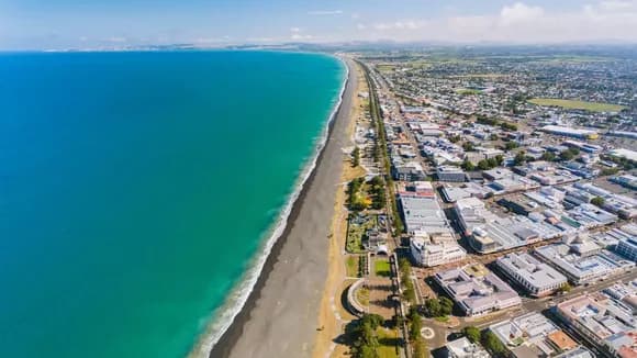
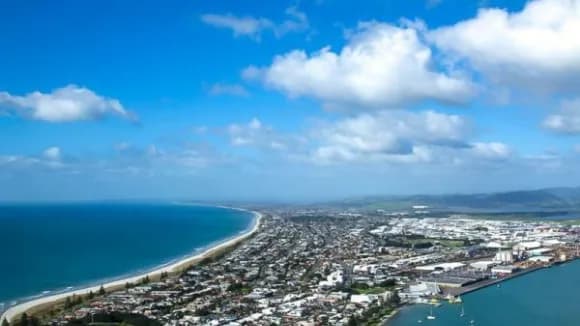
This graph is often used to get a sense of whether property prices look “cheap” or “expensive” within Hawke's Bay.
Learn More
This graph is often used to get a sense of whether property prices look “cheap” or “expensive” within the region.
Learn More

This graph is often used to get a sense of whether property prices look “cheap” or “expensive” within the region.
Learn More
This graph is often used to get a sense of whether property prices look “cheap” or “expensive” within the region.
Learn More

This graph is often used to get a sense of whether property prices look “cheap” or “expensive” within the region.
Learn More
This graph is often used to get a sense of whether property prices look “cheap” or “expensive” within the region.
Learn More

This graph is often used to get a sense of whether property prices look “cheap” or “expensive” within the region.
Learn More
This graph is often used to get a sense of whether property prices look “cheap” or “expensive” within the region.
Learn More
This graph is often used to get a sense of whether property prices look “cheap” or “expensive” within the region.
Learn More

This graph is often used to get a sense of whether property prices look “cheap” or “expensive” within the region.
Learn More
This graph is often used to get a sense of whether property prices look “cheap” or “expensive” within the region.
Learn More
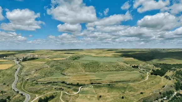
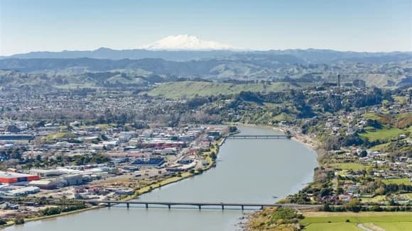
This graph is often used to get a sense of whether property prices look “cheap” or “expensive” within Manawatu-Wanganui.
Learn More

This graph is often used to get a sense of whether property prices look “cheap” or “expensive” within Marlborough.
Learn More

This graph is often used to get a sense of whether property prices look “cheap” or “expensive” within the region.
Learn More
This graph is often used to get a sense of whether property prices look “cheap” or “expensive” within the region.
Learn More
This graph is often used to get a sense of whether property prices look “cheap” or “expensive” within the region.
Learn More

This graph is often used to get a sense of whether property prices look “cheap” or “expensive” within Nelson.
Learn More
This graph is often used to get a sense of whether property prices look “cheap” or “expensive” within the region.
Learn More
This graph is often used to get a sense of whether property prices look “cheap” or “expensive” within Northland.
Learn More
This graph is often used to get a sense of whether property prices look “cheap” or “expensive” within the region.
Learn More

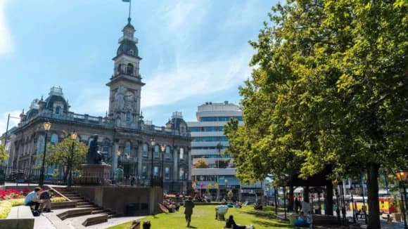
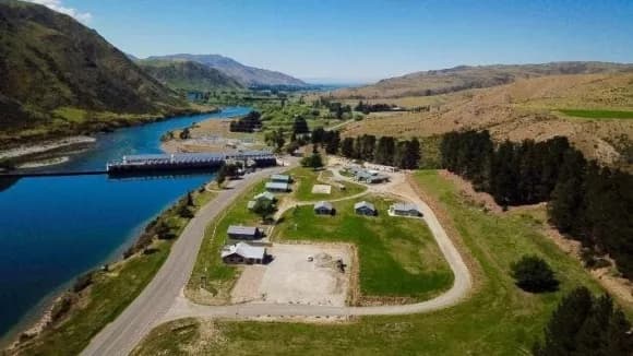
This graph is often used to get a sense of whether property prices look “cheap” or “expensive” within Otago.
Learn More
This graph is often used to get a sense of whether property prices look “cheap” or “expensive” within the region.
Learn More
This graph is often used to get a sense of whether property prices look “cheap” or “expensive” within the region.
Learn More

This graph is often used to get a sense of whether property prices look “cheap” or “expensive” within the region.
Learn More

This graph is often used to get a sense of whether property prices look “cheap” or “expensive” within the region.
Learn More
This graph is often used to get a sense of whether property prices look “cheap” or “expensive” within the region.
Learn More

This graph is often used to get a sense of whether property prices look “cheap” or “expensive” within the region.
Learn More
This graph is often used to get a sense of whether property prices look “cheap” or “expensive” within the region.
Learn More

This graph is often used to get a sense of whether property prices look “cheap” or “expensive” within the region.
Learn More

This graph is often used to get a sense of whether property prices look “cheap” or “expensive” within the region.
Learn More
This graph is often used to get a sense of whether property prices look “cheap” or “expensive” within the region.
Learn More
This graph is often used to get a sense of whether property prices look “cheap” or “expensive” within the region.
Learn More

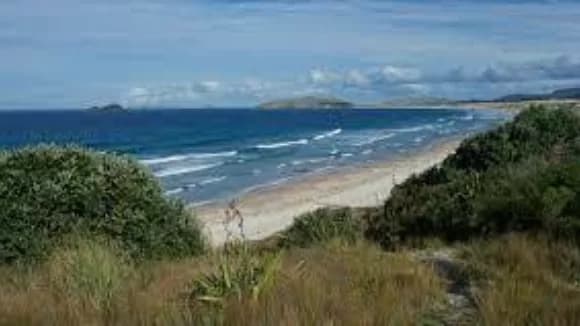
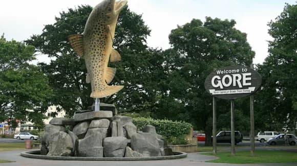
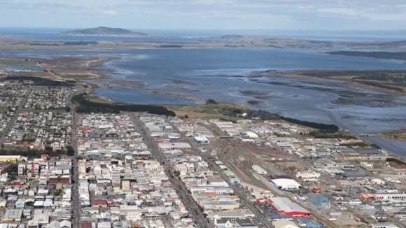
This graph is often used to get a sense of whether property prices look “cheap” or “expensive” within Southland.
Learn More

This graph is often used to get a sense of whether property prices look “cheap” or “expensive” within the region.
Learn More

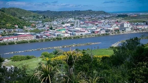
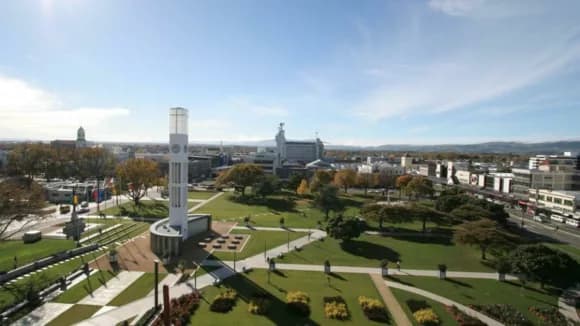
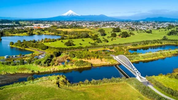
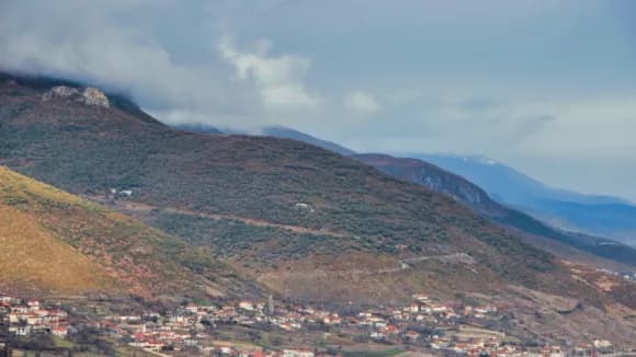
This graph is often used to get a sense of whether property prices look “cheap” or “expensive” within Taranaki.
Learn More
This graph is often used to get a sense of whether property prices look “cheap” or “expensive” within the region.
Learn More

This graph is often used to get a sense of whether property prices look “cheap” or “expensive” within the region.
Learn More

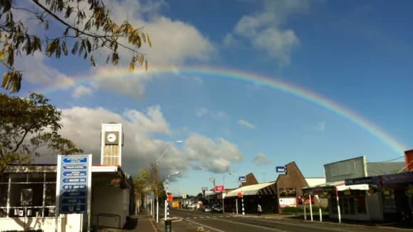
This graph is often used to get a sense of whether property prices look “cheap” or “expensive” within Tasman.
Learn More

This graph is often used to get a sense of whether property prices look “cheap” or “expensive” within the region.
Learn More
This graph is often used to get a sense of whether property prices look “cheap” or “expensive” within the region.
Learn More

This graph is often used to get a sense of whether property prices look “cheap” or “expensive” within the region.
Learn More
This graph is often used to get a sense of whether property prices look “cheap” or “expensive” within the region.
Learn More

This graph is often used to get a sense of whether property prices look “cheap” or “expensive” within the region.
Learn More
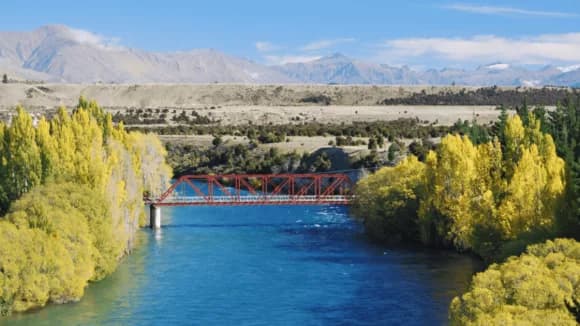
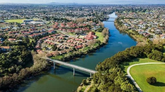
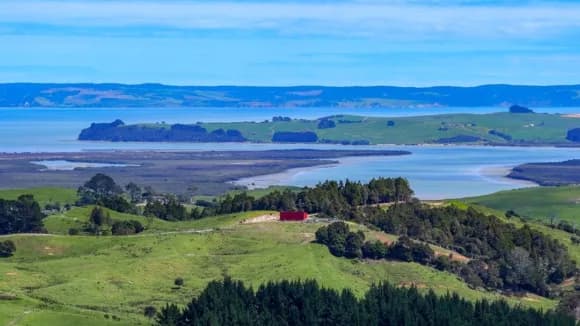
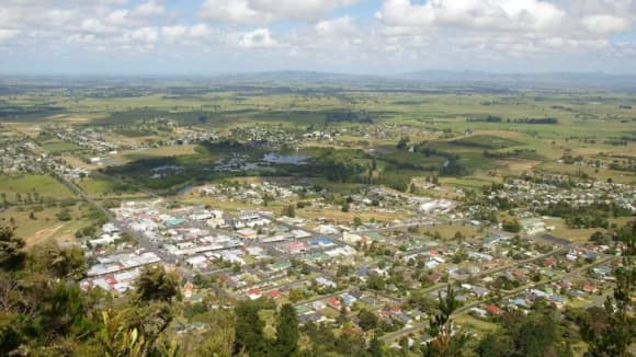
This graph is often used to get a sense of whether property prices look “cheap” or “expensive” within Waikato.
Learn More
This graph is often used to get a sense of whether property prices look “cheap” or “expensive” within the region.
Learn More
This graph is often used to get a sense of whether property prices look “cheap” or “expensive” within the region.
Learn More
This graph is often used to get a sense of whether property prices look “cheap” or “expensive” within the region.
Learn More
This graph is often used to get a sense of whether property prices look “cheap” or “expensive” within the region.
Learn More
This graph is often used to get a sense of whether property prices look “cheap” or “expensive” within the region.
Learn More

This graph is often used to get a sense of whether property prices look “cheap” or “expensive” within the region.
Learn More
This graph is often used to get a sense of whether property prices look “cheap” or “expensive” within the region.
Learn More
This graph is often used to get a sense of whether property prices look “cheap” or “expensive” within the region.
Learn More

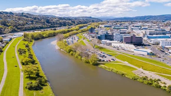
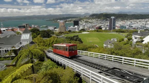
This graph is often used to get a sense of whether property prices look “cheap” or “expensive” within Wellington.
Learn More

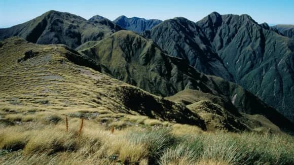
This graph is often used to get a sense of whether property prices look “cheap” or “expensive” within West Coast.
Learn More
This graph is often used to get a sense of whether property prices look “cheap” or “expensive” within the region.
Learn More

This graph is often used to get a sense of whether property prices look “cheap” or “expensive” within the region.
Learn More

This graph is often used to get a sense of whether property prices look “cheap” or “expensive” within the region.
Learn More

This graph is often used to get a sense of whether property prices look “cheap” or “expensive” within the region.
Learn More